
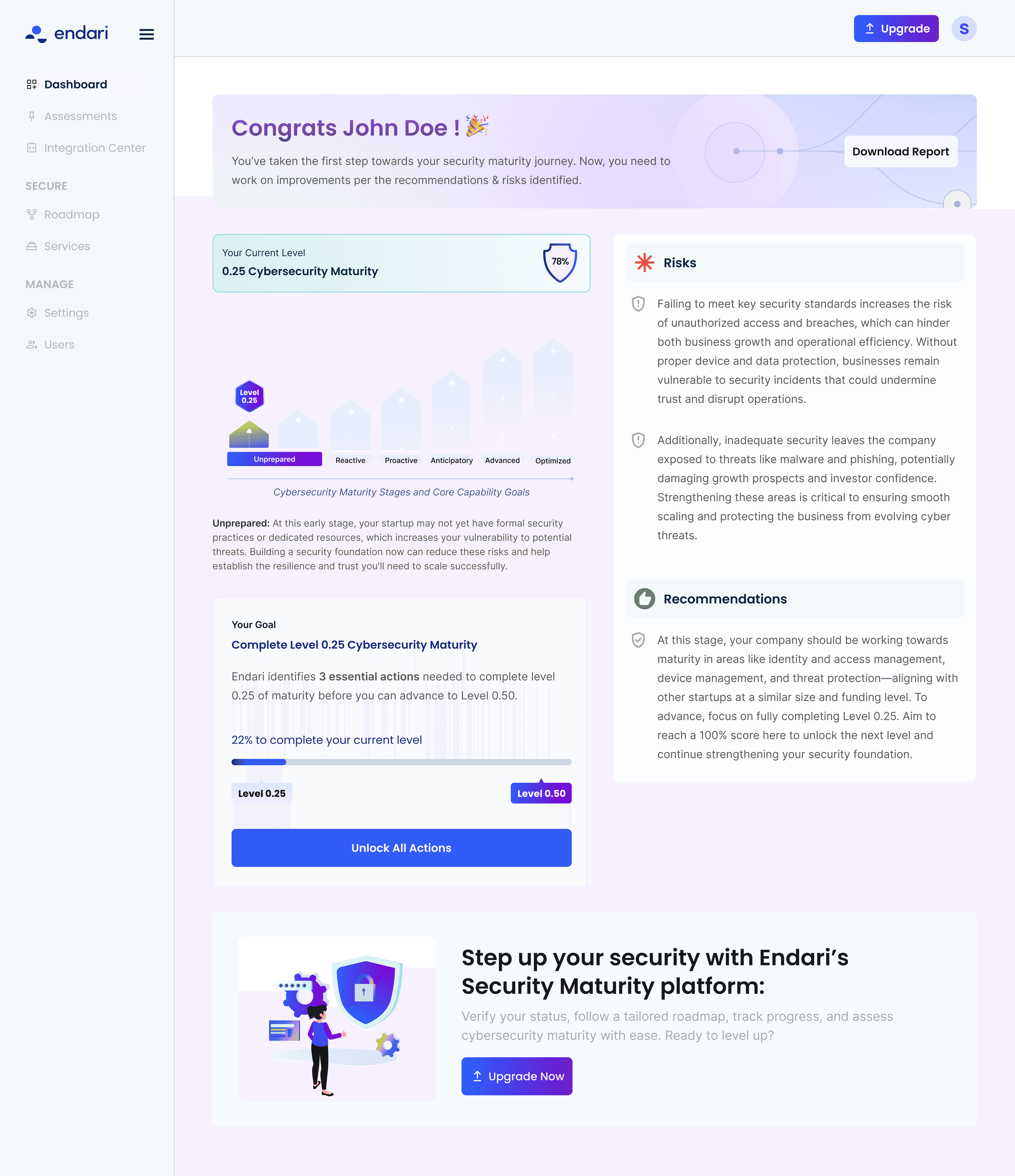
Way.com: Successful parking revamp improved convenience and efficiency
Achieved a 1.4% conversion lift in bookings within two weeks post-launch.
Jun 01 2023
Available in USA,Canada
Way.com is a comprehensive marketplace for car owners, providing a one-stop solution to book everything their vehicle requires from parking and car washes to refinancing and more.
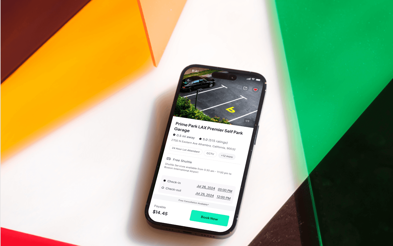
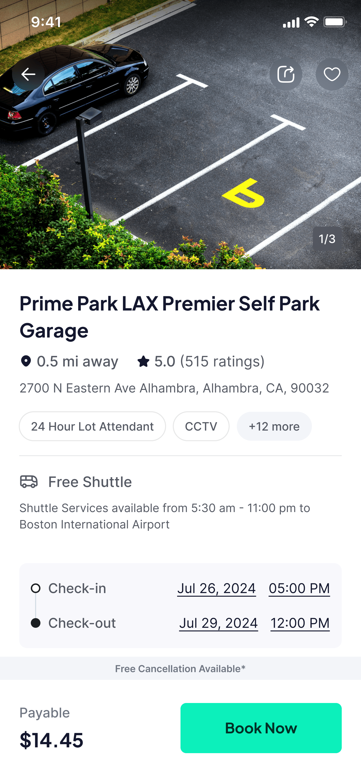
Before / After of the Product
Overview
Duration
1.5 years
Platform
Web & Mobile App
Role
I was the UX Designer on this 17-month redesign project, was part of 5 key verticals: parking, insurance, car wash, gas, and repair & maintenance. I led the revamp of the parking , ensuring a seamless and user-focused experience.
Skills
UX Design
Hi Fi Wireframes
UX Research
Web Design
Usability Testing
Design system
Project Planning
Stakeholder Management
User Centric Goals
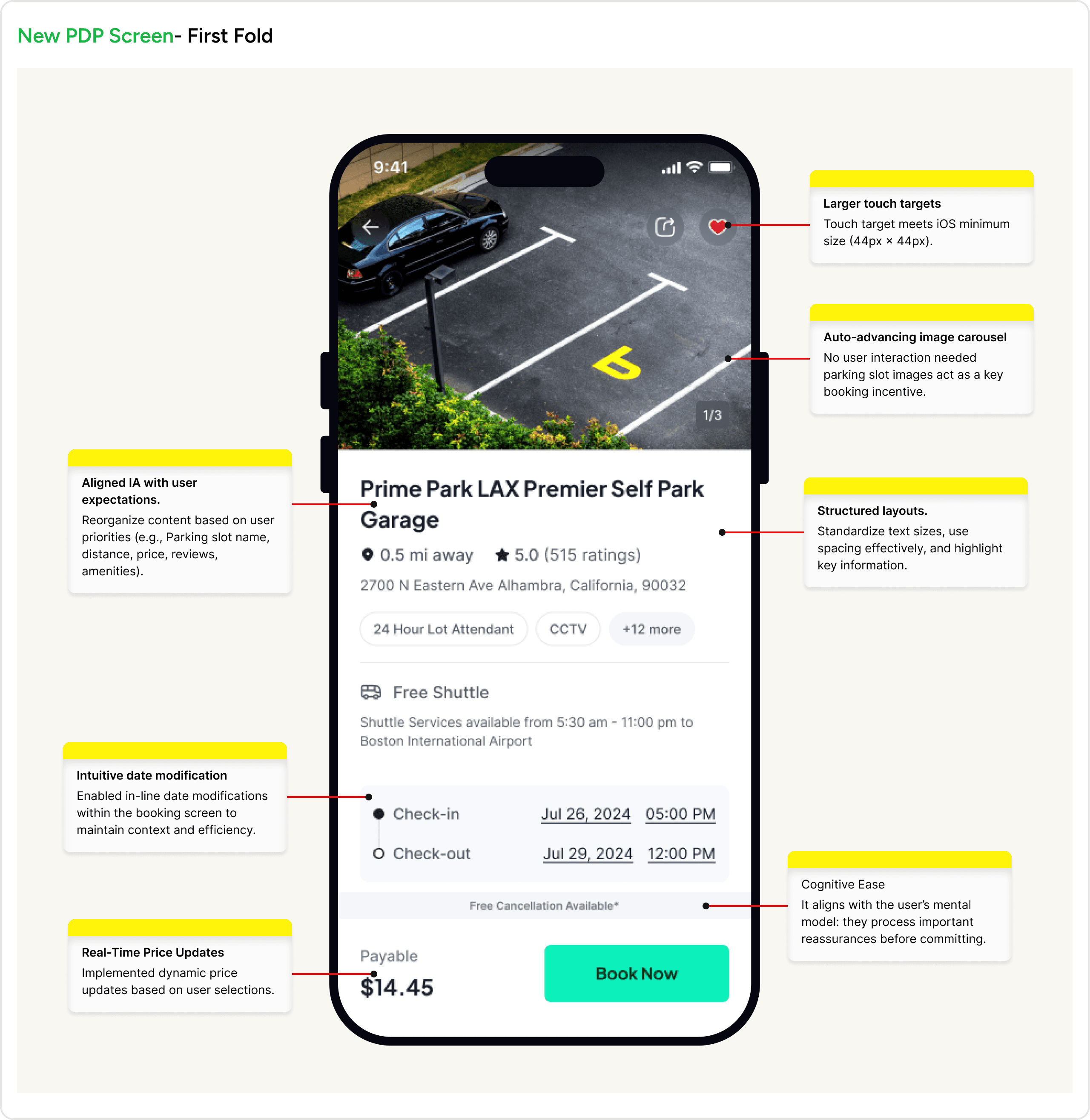
The Product Details Page should help users quickly understand the service, feel confident in its quality, and compare options effortlessly to make a fast, informed decision.
Users should feel secure in their booking with clear policies, trust guarantees, and easy access to support.
Business Goals
The goal is to streamline the booking process to reduce drop-offs and boost conversions, ensuring more users complete their purchases.
Problem Statement
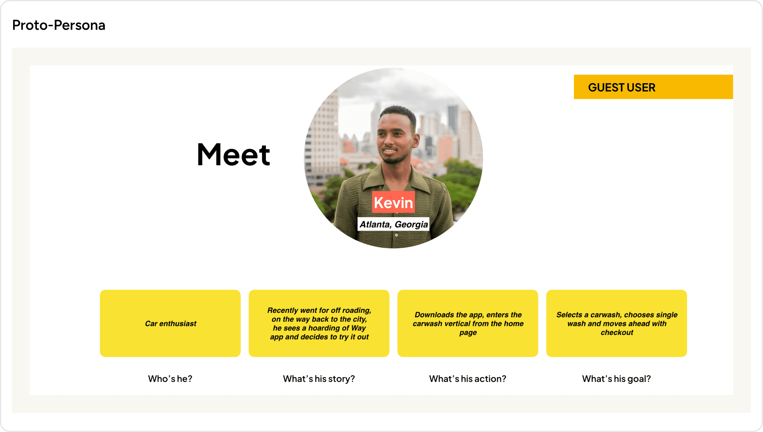
Who are the users?
Frequent commuters and time-sensitive travelers who need a fast, intuitive way to book parking, gas, insurance, or other car-related services without friction.
What is the problem they are facing?
Users faced frustrating booking flows, confusing product details , and unclear cancellation flows that increased support calls and churn.
Why are users facing this problem?
The current app’s cluttered interface overwhelms users with unstructured choices, lacks guidance for multi-step tasks resulting in decision paralysis, drop-offs, and low retention.
What do users need?
The redesign focused on clarity, user autonomy, and enhanced usability features, proving that intuitive design directly fuels business growth.
Process
We adopted a user-centered design framework rooted in empathy and iteration.This cyclical process ensured solutions balanced user needs (speed, clarity) with business goals (higher conversions, reduced churn), ultimately delivering an experience that feels intuitive, trustworthy, and tailored to modern drivers’ demands.

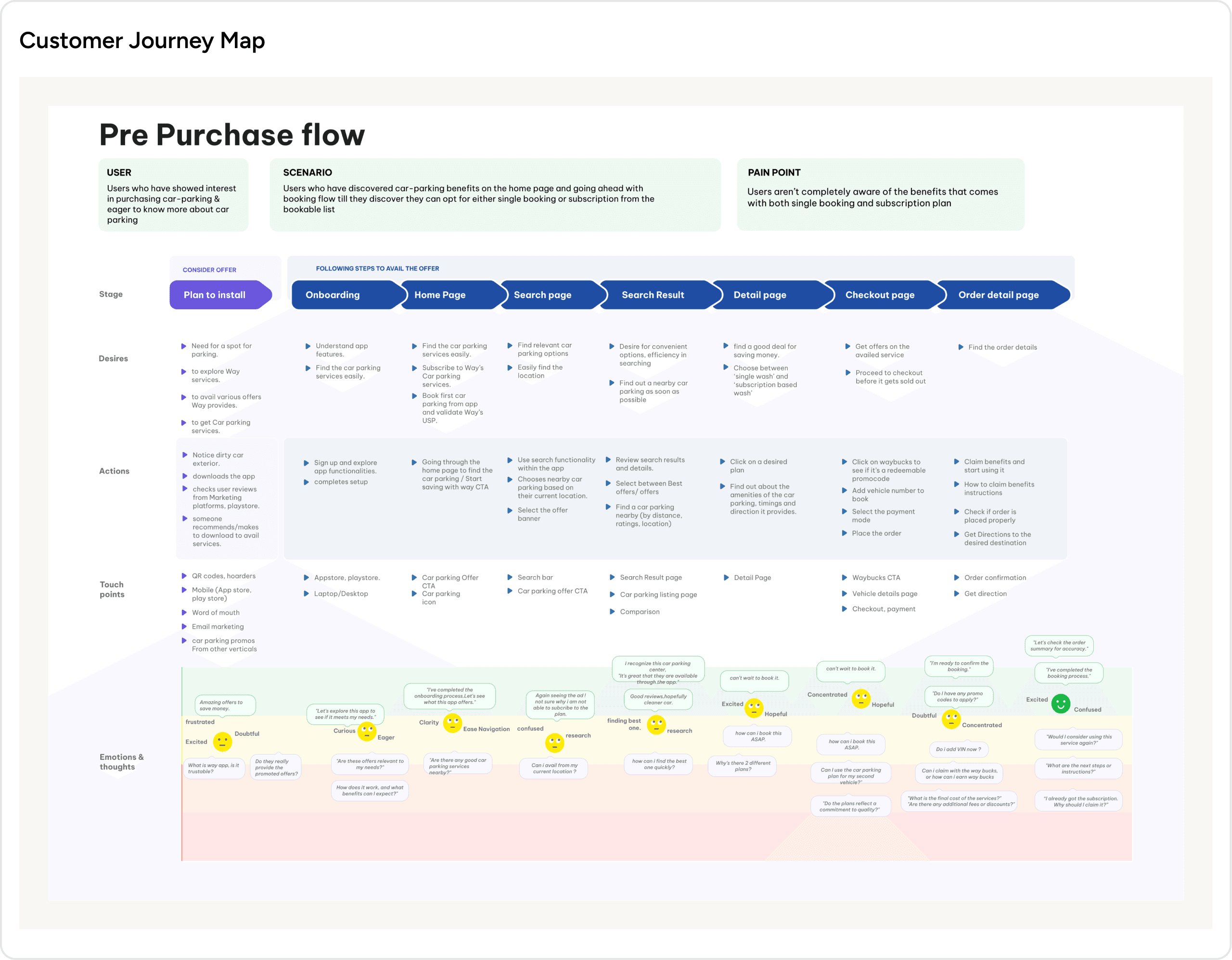
Research Artifacts for Understanding Our Target Audience & Their Existing Experiences
Mapping the journey of users who have shown interest in purchasing car parking and are actively seeking more information about their options.
Solutions

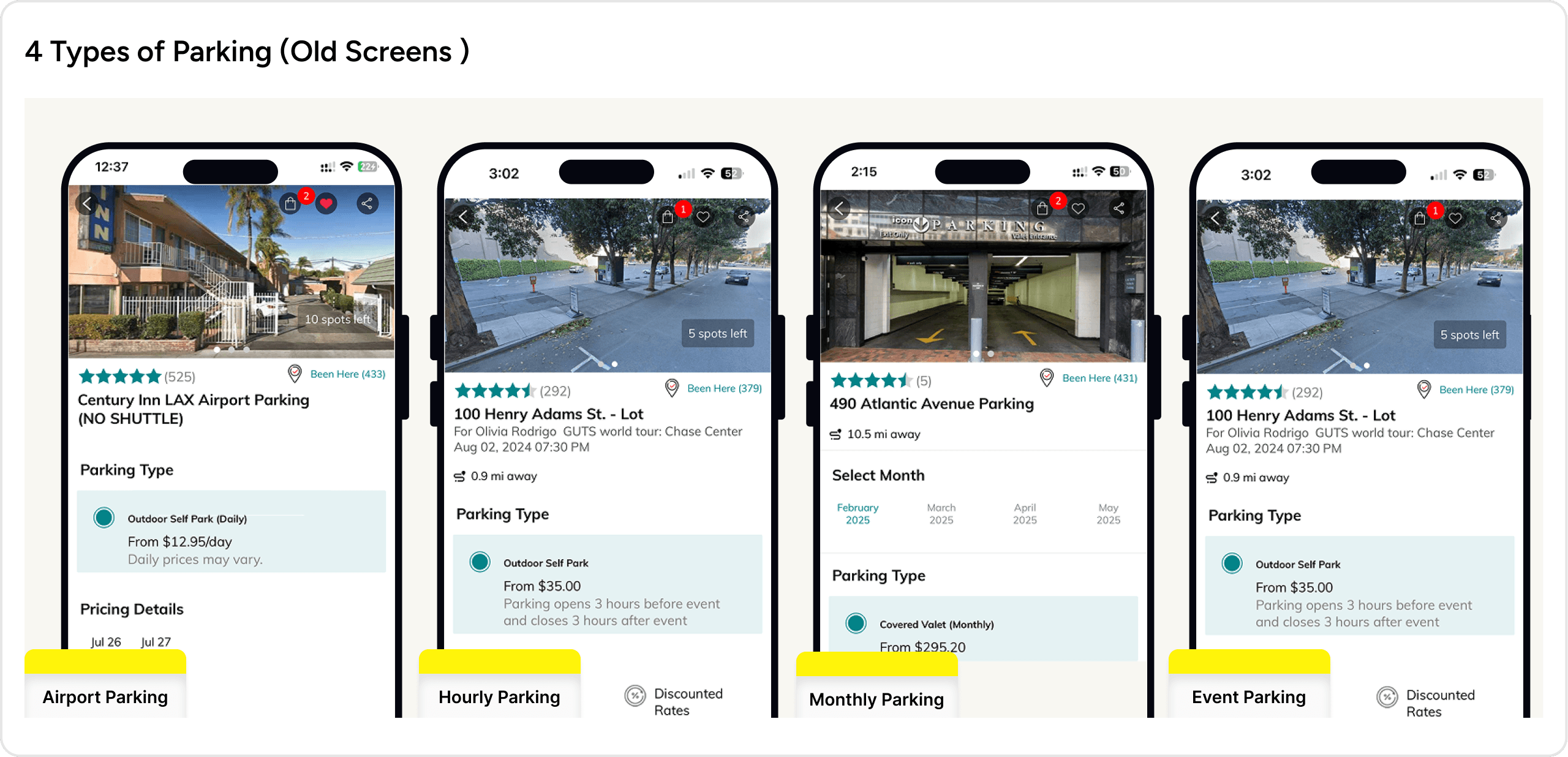
Over 4 months, we redesigned Parking Vertical which is over 200+ app screens to unify the user experience across Way.com’s four parking verticals -
Airport Parking
Hourly Parking
Monthly Parking
Event Parking
This case study highlights two critical solutions that drove measurable impact :
Product Details Page (PDP) Redesign
Cancellation Flow overhaul.
Product Details Page (PDP) Redesign
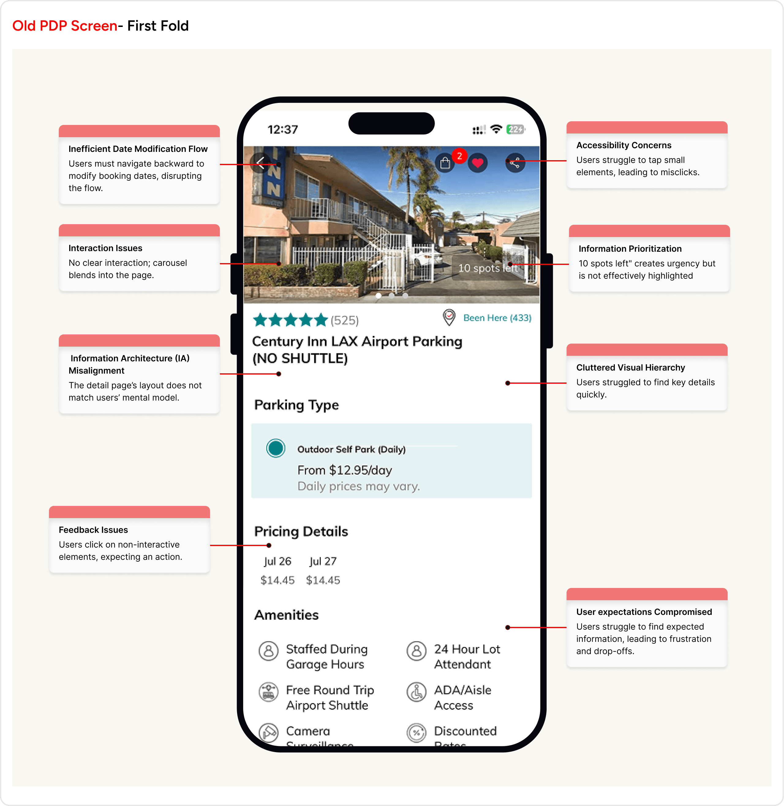
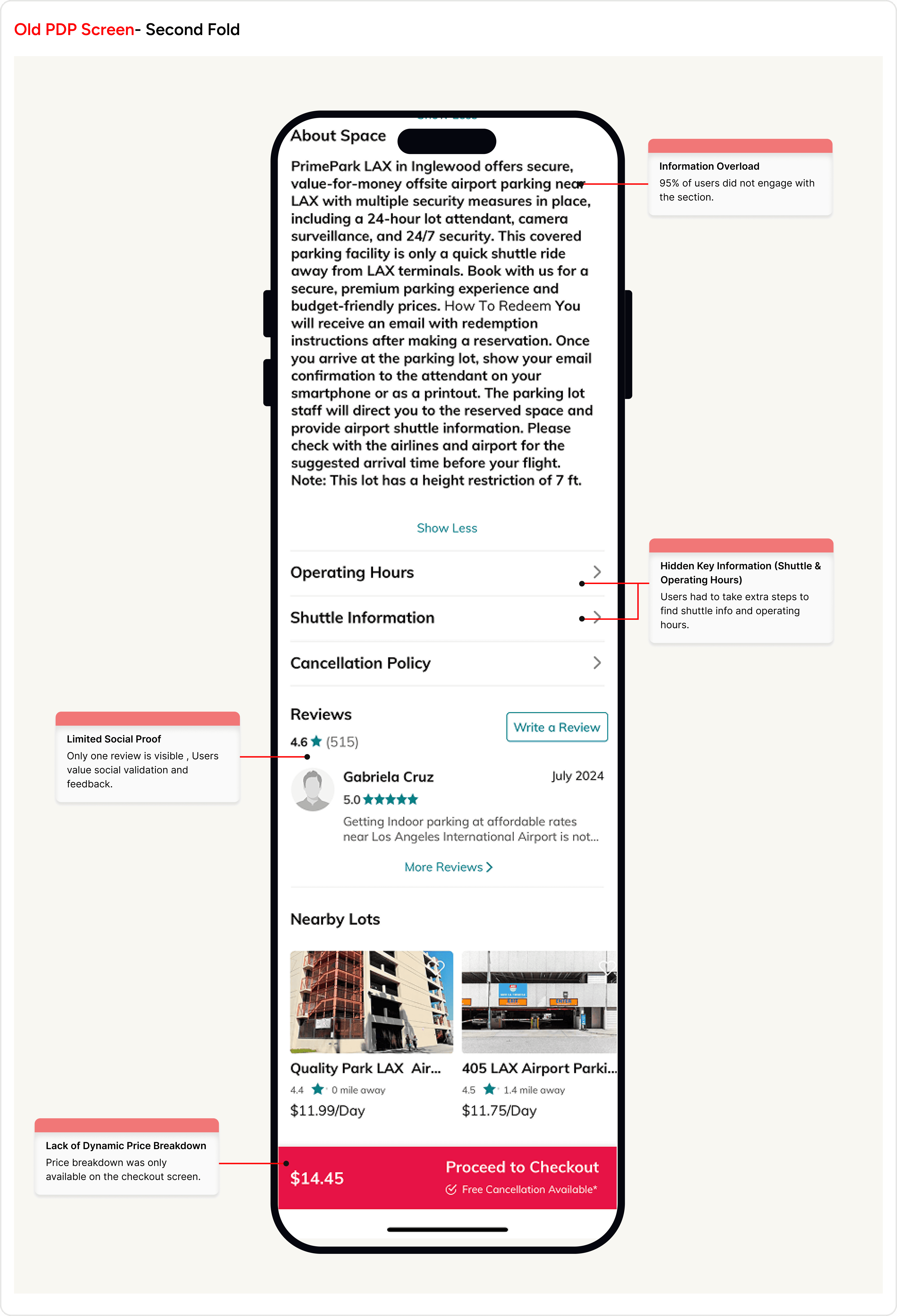
Users faced frustrating booking flows such as excessive clicks, backtracking between listings, confusing product details that buried policies and hard-to-find availability.
Impact:
Lost Conversions: Cumbersome navigation and cluttered layouts slowed decision-making.
Damaged Trust: Opaque policies and fragmented self-service tools eroded user confidence.
Higher Costs: 30%+ of support queries stemmed from preventable cancellation confusion.
Abandoned Bookings: Users leave mid-flow due to confusion or fatigue.
Missed Revenue: Poor visual hierarchy hides time-sensitive deals (e.g., discounted car washes).

Cancellation Flow Redesign
30% of post-purchase support calls were about cancellations, driven by hidden policies and a fragmented flow. Users felt trapped, harming trust and retention.
Impact:
Lost Trust: Users hesitated to book again due to unclear policies.
Higher Support Costs: A significant portion of customer service resources was spent clarifying cancellations.
Increased Drop-offs: Users abandoned bookings after struggling to understand cancellation terms.
Missed Opportunities: Lack of transparency reduced confidence in future purchases.

In the new screens, we applied Tessler's Law, ensuring that the necessary complexity of canceling a booking is handled thoughtfully. The cancellation process is shown below the booking details, alongside relevant actions, making it intuitive while maintaining the required steps for clarity and confirmation.

Outcome
We noticed users dropping off during the booking process, so after careful consideration of matching the mental model of the user, we simplified the flow—making forms clearer, reducing unnecessary steps, and placing calls-to-action where they felt natural. After launching these changes, we saw a 1.4% boost in conversions, making it easier for users to complete their bookings seamlessly.
Before
❌ Cluttered & Confusing Pages – Key details like pricing, amenities, and policies were buried, forcing users to hunt for information.
❌ Disjointed Navigation – Users frequently lost context due to fragmented parent/child listing structures, leading to excessive backtracking.
❌ Opaque Self-Service – Lack of clear guidance left users uncertain about modifying or canceling bookings, increasing reliance on support.
After
✅ Clear & Concise Product Pages – Visual summaries surface pricing tiers, amenities, and policies upfront, eliminating clutter.
✅ Seamless Parent/Child Navigation – Unified interface retains context, reducing backtracking between listings.
✅ Intuitive Self-Service – Guided “Modify Booking” flow empowers users to cancel/reschedule confidently.
Learnings
Consistency Drives Trust:
Unifying design patterns across diverse parking types (airport, hourly, etc.) reduced cognitive load and reinforced user confidence. A standardized UI language ensured users felt "at home" regardless of the service type.
Small UX Tweaks, Big Business Impact:
A 40% drop in cancellation-related calls proved that self-service tools (e.g., guided flows) not only empower users but also reduce operational costs.
Read more


©Yuviedesigns 2025.
Trivandrum, India