
Endari: Enhancing Assessment Completion through Behavioral Design
Redesigned the MVP for a seamless user experience, reducing drop-off by 80% through improved usability and intuitive design.
Nov, 2024
Available in USA
Endari is a Cybersecurity Maturity Evaluation Tool that specializes in helping startups and small to medium-sized businesses (SMBs) build and mature their cybersecurity practices.
Before / After of the Product
Overview
Duration
3 months
Platform
Web Portal
Role
I was the UX designer and Project Manager.
we started as a team of 3 designers, 2 developers, and 1 UX writer including me. I guided the design vision, collaborated closely with peers, and delivered the project on time.
Skills
UX Design
Hi Fi Wireframes
UX Research
Web Design
Usability Testing
Design system
Project Planning
Stakeholder Management
User Centric Goals
Implement strategies that can be used to make cybersecurity assessments quicker and more efficient for SMBs.
To keep users engaged and motivated throughout the assessment process to ensure completion.
Business Goals
Optimizing assessments and boosting engagement will drive higher completion rates, upsell opportunities, and long-term revenue growth.
Problem Statement
Who are the users?
Startup founders and SMB IT managers who need to assess and improve their cybersecurity maturity.
What is the problem they are facing?
Long, impersonal cybersecurity assessments that take 1-3 hours to complete, leading to frustration and high drop-off rates.
Why are users facing this problem?
Existing tools cause cognitive overload with lengthy question lists, lack clear guidance on progress, and feel tedious and unengaging, making it difficult for users to stay motivated and complete the process.
What do users need?
Delivers a personalized, intuitive, and engaging assessment experience that keeps users motivated, ensures higher completion rates, and provides clear, actionable recommendations for strengthening their cybersecurity.
Process
Understanding Our Target Audience & their Existing Experiences
To build an intuitive and user-centric experience, we first needed to understand our users their pain points, motivations, and unmet needs.To improve the product experience, We performed a Heuristic Evaluation and Usability Audit that uncovered numerous usability issues, feature gaps, and opportunities for improvement on some existing products for measuring cyber security assessments.

We categorized the User's journey to taking Assessments into four critical areas:
Triggers
Our goal was to understand what prompts users to take the assessment.
👉 Conducted Surveys to understand external and internal motivations of SMBs.
👉 Stakeholder interviews to determine the most effective way to communicate importance of taking cybersecurity maturity.
💡
Actions
Our goal was to identify and minimize friction points in the assessment experience.
👉 Analyzed the existing drop-off points in the assessment flow using focus group.
👉 Prototype and test progressive disclosure techniques (e.g., breaking assessments into smaller steps).
🚀
4. Investment
Our goal was to create long-term commitment.
👉 Tested personalized result summaries to reinforce the value of assessments.
📈
🏆
Variable Rewards
Our goal was to identify What keeps users engaged to complete the assessments.
👉 Explored gamification elements (e.g., badges,level roadmap) and evaluate user response.
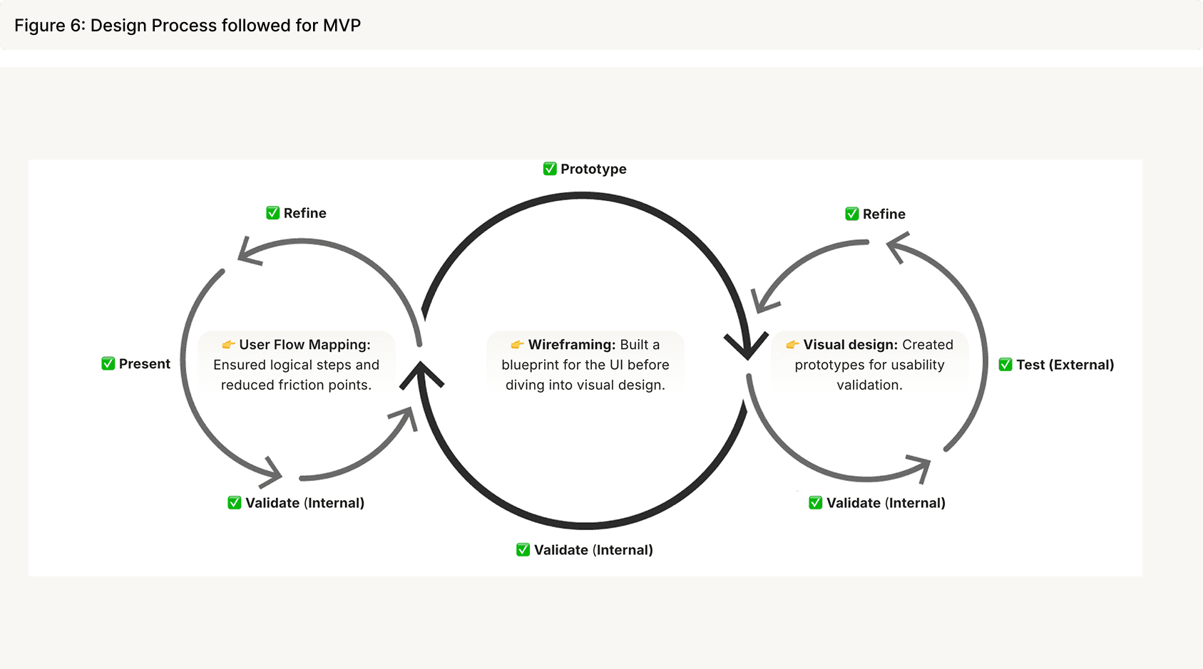
Lean UX Design Process with Internal & External Validation
We started with an optimized user flow that streamlined navigation and improved engagement. Each touchpoint was carefully structured to reduce cognitive load and make key actions more intuitive.
Solutions
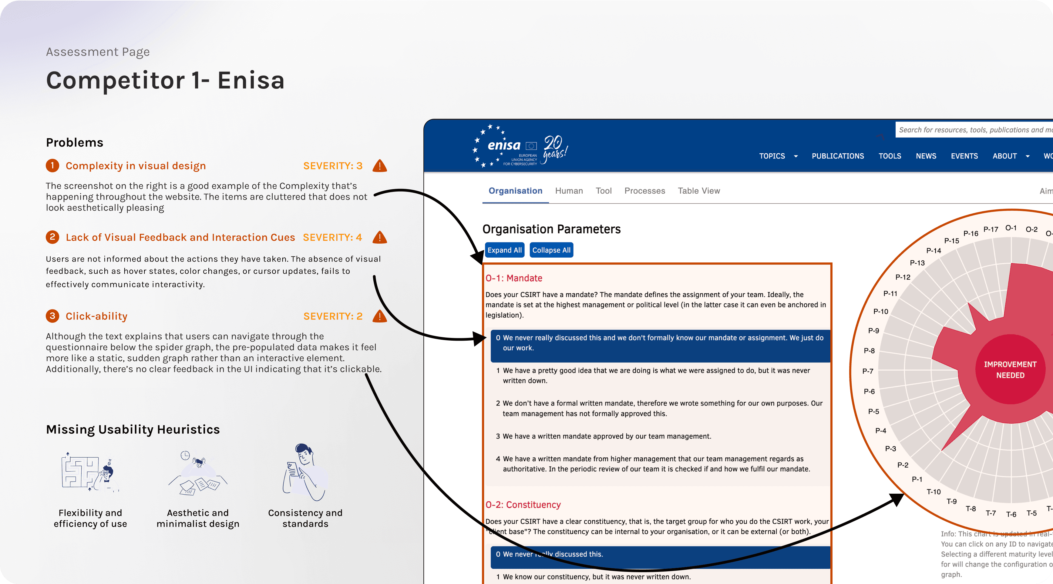

Competitor Analysis – Enisa & One Identity,we analyzed to identify key usability challenges and opportunities for improvement.
Right-click and open in a new tab for a detailed view.
One of the evaluations of the Result flow-
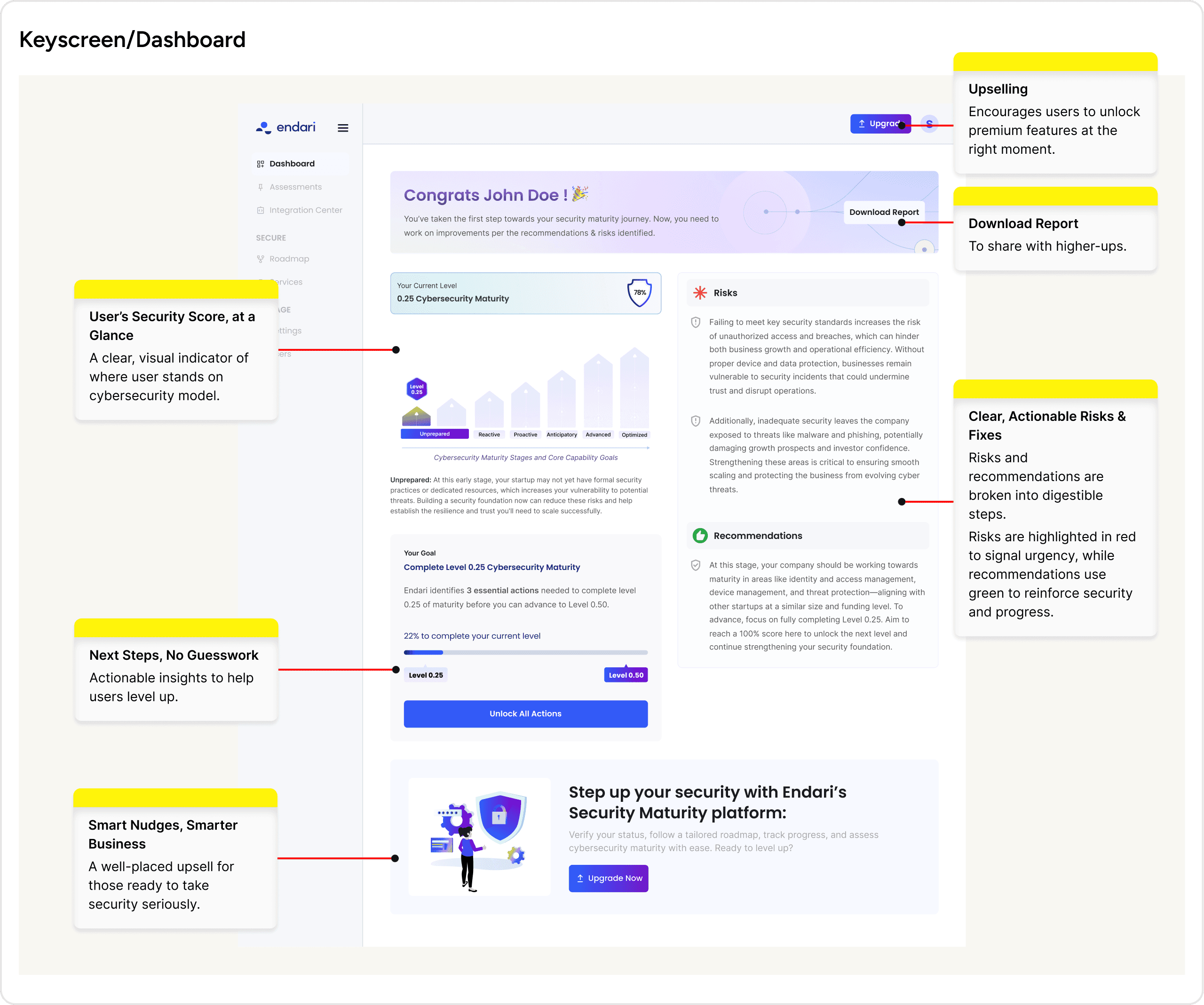
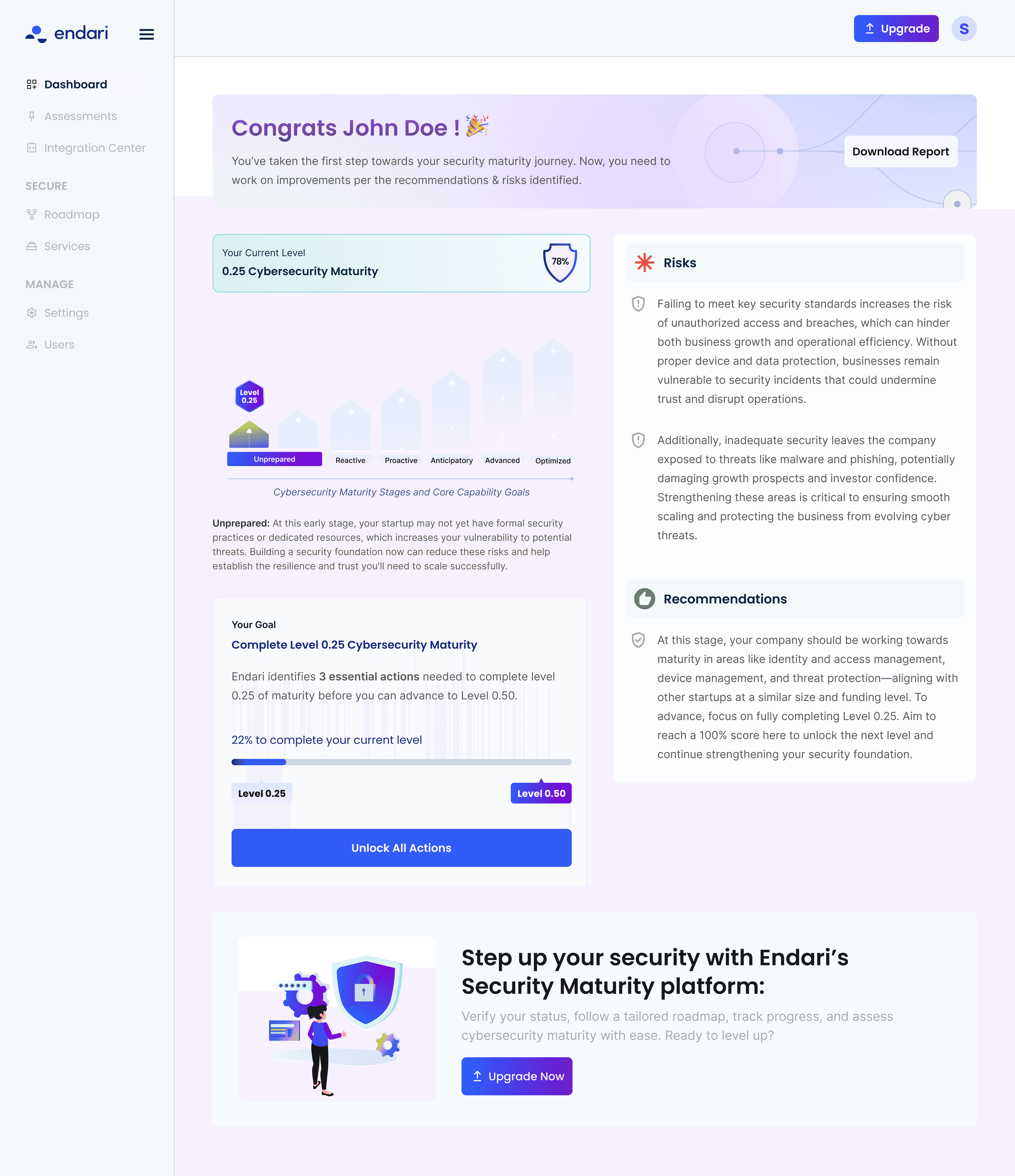
User testing revealed significant findings that led to the creation of new flows and interactions for the dashboard. Additionally, a strategy was needed to integrate cross-selling opportunities for the business.

By eliminating ambiguity and optimizing each interaction, we keep users engaged, motivated, and on track to securing their business.
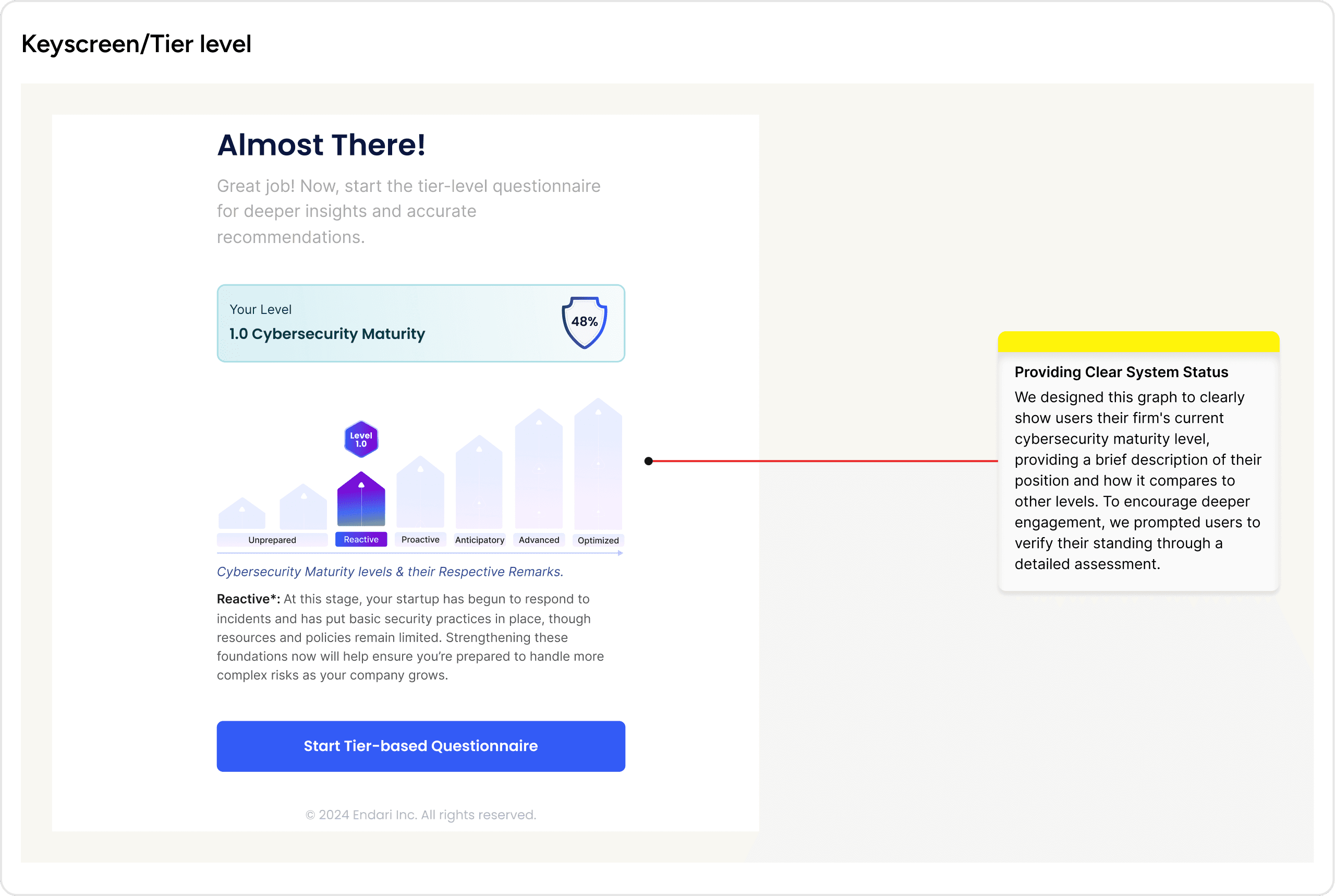
We designed over 50 web screens for Phase 1 of the Endari dashboard. In this case study, I’ll walk you through 7 key screens.
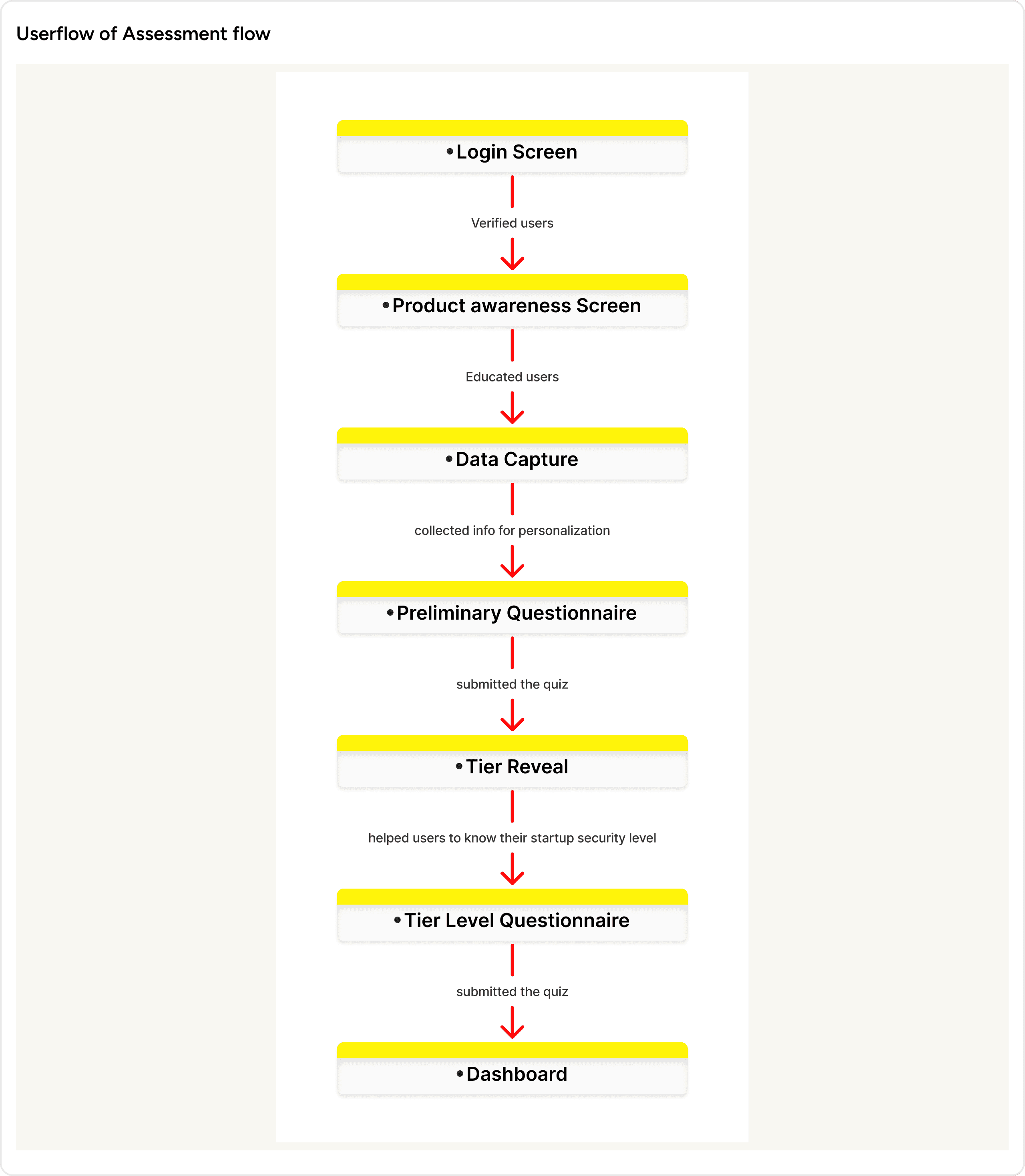
Key Screens of Assessment Flow
Since this is a new product, users need a quick, clear understanding of its value. To reduce friction and drive engagement, the experience must be seamless , guiding users directly to the assessment with minimal distractions.
A restrained color palette and subtle animations on the left side maintain focus on the sign-in process while offering a seamless, unobtrusive glimpse of the product. Concise messaging, key benefits, and clear CTAs ensure a smooth transition.

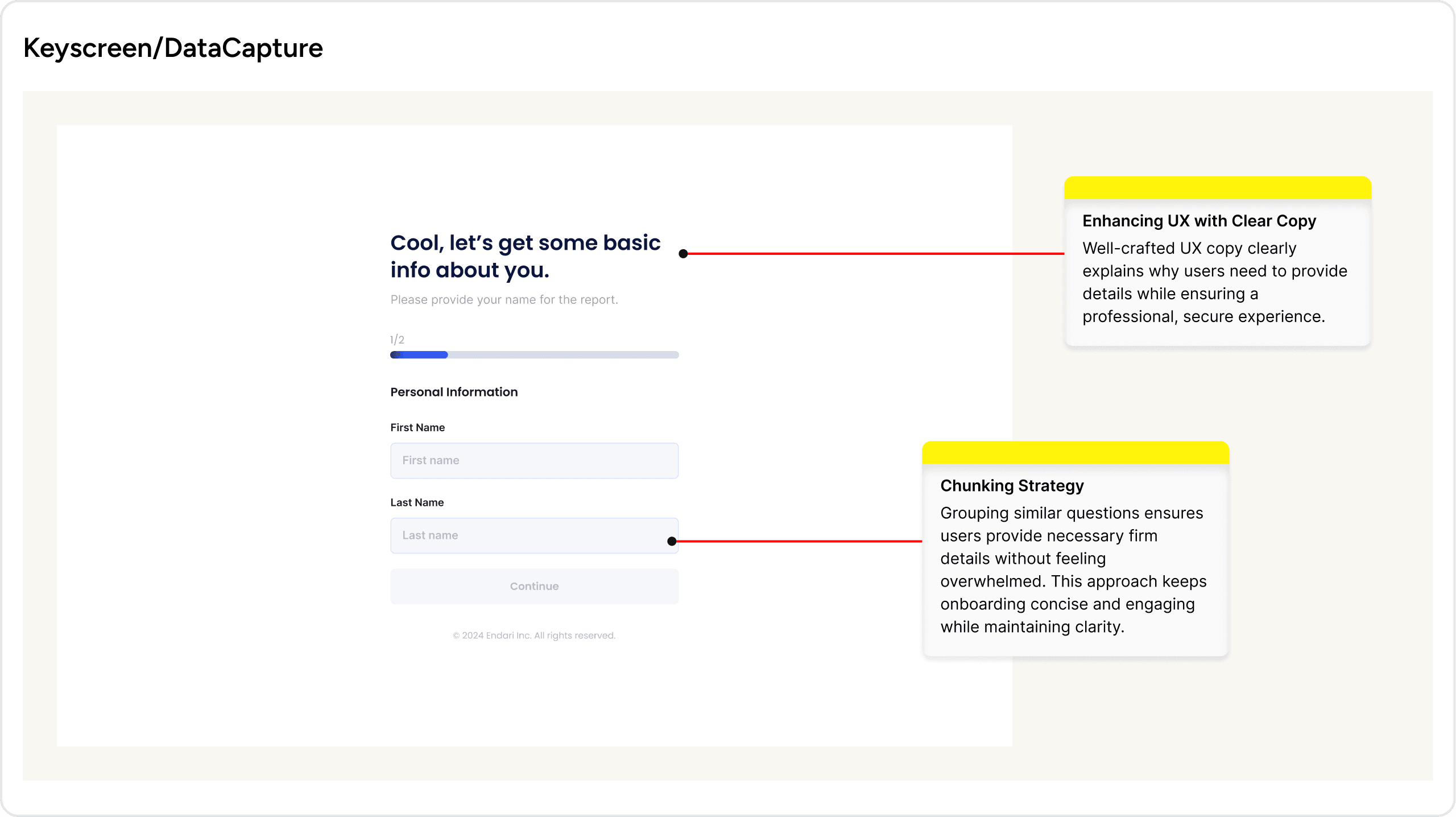


After conducting user testing with a focus group of 8 potential clients, we opted for a one-question-at-a-time approach. The reasoning was clear: 7 out of 8 participants (87.5%) preferred Version 2, as it reduced cognitive load and made the process feel less overwhelming. This approach increased user motivation and engagement, ensuring a smoother experience.
Outcome
In user testing of the previous MVP, 4 out of 5 users (an 80% dropout rate) failed to complete the assessment due to confusion with the flow, as the entire set of 160 questions followed this format.
In the proposed design, all 8 users easily completed a smaller set of 25 questions, highlighting the impact of a simplified and user-friendly approach.
Before
❌ Users were presented with a long, continuous questionnaire, potentially overwhelming them.
❌ Upto 160 questions were presented at once, leading to disengagement.
❌ No motivational elements to encourage progress through the assessment.
After
✅ The questionnaire is divided into manageable sets to reduce overwhelm.
✅ Questions are displayed one at a time, catering to users’ shorter attention spans.
✅ Badges are introduced to reward users for completing different phases, boosting engagement and motivation throughout the process.
Learnings
Reflecting on the process, I’ve learned the value of advocating for more time to refine the product rather than rushing to release small increments.
By prioritizing time for iterations and testing, we ensured the MVP maintained essential user flows and performance, even if it meant delaying certain features to provide the best possible user experience from the start.

Read more


©Yuviedesigns 2025.
Trivandrum, India